Health record with lab results and patient services

The main problem as I saw it, was that the board's proposal didn't address the serious problems in the area, e.g. that the systems should exchange data, and avoiding that suppliers get a monopoly. The board never replied, but in October 2005, Henning Mølsted from the newspaper Ingeniøren phoned me and asked for an interview. His article created a media debate, starting with the actual problem, but soon becoming a fruitless debate where some said that EHR didn't work at all, others that it worked very well. As usual, the disagreement was that people didn't discuss the same issue. Some people talked about the big problems that didn't have a solution, others about things that worked well, e.g. the sub-system for medication.
At the EHR conference at Nyborg Beach, October 2005, Esben Dalsgaard from the board said that he agreed with my comments, but what I asked for, wasn't the board's responsibility. Unfortunately, he is probably right. Important government problems often end up in a gap, in such a way that everybody assumes it is someone else's problem. IT architecture is apparently one of them
A mistake that had blocked progress was that stakeholders believed that each medical specialty needed its own system with its own database. The idea to have one database with many user interfaces, was incredible.
What would the cost be for each of these solutions? Surprisingly, it would be 2-3 times more expensive to go for solution 1 or 2, than going for solution 3 (one new platform).
I also looked at other factors than economy, e.g. data migration, needs for specialists, education and transfer of staff, acquisition of new modules or equipment, supplier monopoly. Everything pointed at solution 3. Further, I outlined a time schedule for implementing solution 3.
Details of the three solution are in this report: Download solutions (pdf, Danish)
Details of the financial calculations are here: Cost calculation (xlsx, Danish).
So what did they decide? Nothing. Each region made small changes. Not until 2013 did any major change take place: Two regions acquired EPIC and made it their common platform for all EHR in 17 hospitals. See Acquisition of EPIC below.
Health record with lab results and patient services

In 2011 we had an operational prototype of the entire system, and we had tested that spreadsheet-level end-users could use the tool for development. We had shown Uvis to several suppliers of health record systems and to some software houses. They could see the potential, but their present focus was expanding their products with web and mobile user interfaces. It wasn’t obvious how Uvis could be ported to these platforms. Some of the companies said that if the system had been for the web or a mobile platform, they would use it right away. See more on the tool - or try it yourself: Data visualization and EHR
2013: Anonymizing a large health record database
As part of the uVis project, we anonymized a relational database of 300,000 electronic health records. This was much harder than anticipated. Structured data in the tables were relatively easy, but identifying data could also hide in free-text notes. We also had to ensure consistency so that data still gave a correct picture of the patient's medical history: Preserving medical correctness . . .(pdf, 13 pages, 2016)
In 2014 our health record database included all kinds of medical information: 27,000 diagnoses, 17,000 kinds of lab tests, 17,000 kinds of clinical activities (including X-ray pictures, etc.), tables of clinical users and organizations. The table of medicine types is supplemented with a table of 13,000 drugs with trade names. Patient-specific data is covered by 10 tables. One thing we didn't try to cover was billing and accounting. In total the system comprises 26 tables, including simple tables such as a list of urgency codes.
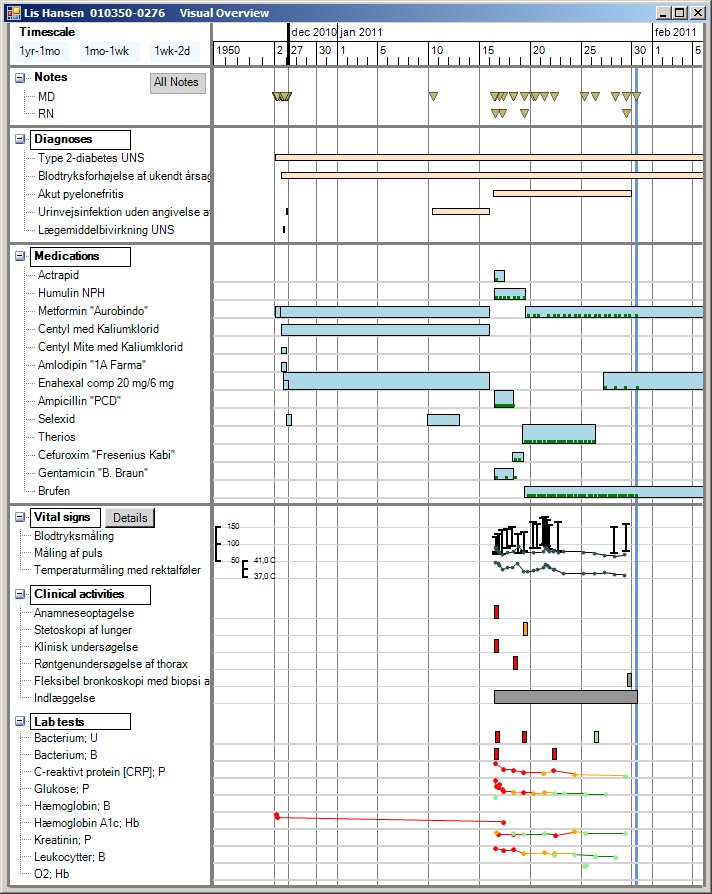
The figure shows a patient lifeline including doctor's notes, diagnoses, medication, lab tests and other kinds of service. Services with numerical results are automatically shown as a simple line graph, other services as boxes. Some services can be shown in a special way when you click their box. There are additional screens for ordering medicine, giving medicine, ordering services, etc. In total around 20 screens, all made with Uvis - and without programming.
However, many users were annoyed with the system, productivity was low in many clinics, and at the end of 2019 no financial benefit had been reported. Rumors were that the wrong system had been selected. What went wrong? The short answer is: Many things, e.g.: They used the wrong selection criteria, although it looked right on paper. They deployed too much too early and didn't adjust the deployment process. They didn't plan the new work processes for individual clinics. They deployed the system with insufficient support and training. You can see the details in these papers:
2017: Soren Lauesen: Damages and damage causes in large government IT projects. Damage case stories (pdf, 59 pages). This report investigates 5 large, troubled projects. What went wrong and how to prevent it? The EPIC project is Chapter 5.
2017: Soren Lauesen: Why EPIC was chosen and the consequences. This paper investigates how the customer selected the health-record system EPIC, and why they didn't realize that work with the new system would be much slower in many of the medical areas. Choice of EPIC - in Danish (pdf)
2017: Soren Lauesen: Time study of EPIC in the clinic: The paper contains Lauesen's detailed time study of consultations in an endochrinological clinic that had used EPIC for about a year. Around 40% of the time was spent by the doctor clicking and typing without patient contact. Around 30% was spent by doctor and patient jointly looking at the screen (great!). Changing the patient's medication dose required 25 clicks. The average observed consultancy time was around 18 minutes. The department budgets with it being 15 minutes. With the old system, the time was 10 minutes. Download report - in Danish (pdf)
2017: Oliver Metcalf-Rinaldo and Stephan Mosko Jensen: Learnings from the implementation of EPIC. These reports describe the many accidents when deploying EPIC, e.g. lack of user training, slow update of the patient's medication data, medicine orders that disappear. Learnings from implementation of EPIC (pdf, 54 pages), Appendix (pdf, 27 pages)